
Unboxing the blackbox.
A behavioural-based mental model approach to decrease cognitive burden and increase customer success.
client
Kitchener-Waterloo
media
Mobile and Web
Role
Lead Researcher
―
The Ontario government commissioned RBB Innovations to develop a centralized childcare registration system. RBB’s OneHSN Childcare Registration allows parents to apply to childcare providers using a single online form. Since its first launch in the Kitchener-Waterloo Region in 2009, the company found that users have consistently reported high levels of dissatisfaction and the dropout rate has steadily increased to 21.6%.
Our team of four from the Knowledge Media Institute was brought in to work with RBB to complete a UX re-design. We conducted a behavioural-based mental model approach to decrease users’ cognitive burden and improve their overall experience with the system.
Over the course of 18 months, we completed a heuristic evaluation and identified a restrictive linearity, an invisible algorithm, and an unassuring conclusion as the key usability issues. Our UX intervention tackled these issues by designing a more visible process and engaged users with more control, agency, and intention.
The result was fascinating, the dropout rate dropped down to 7.4% in the first month of redesign and users have consistently reported significant improvement in their overall experience with the system – increased by 63% in survey (n=108).

Donald Norman's Design Squiggle
Usability Testing
We completed a usability test with 20 real users to build on our previous results from heuristic evaluations. Usability testing is a way to evaluate and study an interaction design product by testing it on users based on user-centered design principles. The behavioural data collected from this study allowed us to test what users actually do, rather than either what they think or we think they will do. While our designs have been made with the user’s experience in mind, we should ensure that the mental model matches our conceptual model. Usability testing measures the effectiveness, efficiency, and satisfaction of specific users as they pursue specific goals within a specific context of use.
We are particularly interested in testing; (A) the effectiveness of the introductory cartoon splash page in developing mental models; (B) to evaluate the ease of understanding the account creation and dashboard navigation; and (c) the effectiveness and ease of use of the Program Finder and My Favourites combination

Key Issues Identified

Restrictive Linearity.
Users found the application’s unyielding step-by-step process to be tedious and time-consuming.
Invisible Algorithm.
Between the steps of filling out child information and selecting preferred programs, users had little understanding of the mechanism behind program result generation.
Unassured Conclusion.
After the users submitted their applications, the system provides no further information. Users thus feel obligated to follow up directly with childcare providers, thereby circumventing the system meant to help them.

Current concept model and the ‘black box’
Proposed Solution
UX Intervention
After the long journey, our team decided to employ several User Experience (UX) Design methods to enhance the functionality and usability of the OneHSN System. Our approach focuses on improving user navigation and orientation within the ecosystem. Users often reported that they felt exhausted, confused and unassured throughout their application process. To address this issue, we proposed key design principles for the new design: freedom, confidence, confirmation and assuring decision-making. Through the process, we proposed the following design goals:
ONE.
Increasing user’s freedom to navigate as they please to solve the restrictive linearity problem.
TWO.
Adding notifications and status updating features to dispel the unassuring conclusion
THREE.
Minimize the system’s opacity by making the invisible algorithm visible
User in Control
To address the blackbox issues, we proposed a new concept model that matches the current user expectations and mental model.

Proposed ‘user-in-control’ site flow

Below story board presents the workflow and emotional experience we imagine for users in our usability design. In this example, we are trying to reconfigure the mental model of how one applies and accepts placements. That it should re-orient the service to position daycares as something precious, scarce - that cancelling existing applications upon a successful placement doesn’t have to be forced on the user; but that by changing expectations it can become the default action.
Mid-Fidelity Prototype
Conclusion
We made several design changes that would significantly improve the ease of use and flexibility for the user. By improving the user experience, the design will reduce user error, reduce the need for service support and assistance, and provide users with delight in using the service. The key goal was to increase customer and user satisfaction and decreased user frustration. Our proposal is intended to:
Break the linearity
Build an easier mental model for users
Help users orient in the system
Our proposed design simplifies the application process and reduce the total time spent by streamlining the information flow and reducing cognitive load throughout different stages in the application process. The new design also allows users to personalize their application procedures by adjusting preferences and comparing their searching results – make the invisibles visible. One of the key feedbacks from the end users was that they felt “helpless and lost a sense of control” over one of the most important life decisions they are making for their young children. To address this issue, we proposed to enable users to double check their preferred options through Workbook, making applications more deliberate and impactful. Lastly, the proposed design Increases action hierarchy by implementing application status updates and notifications
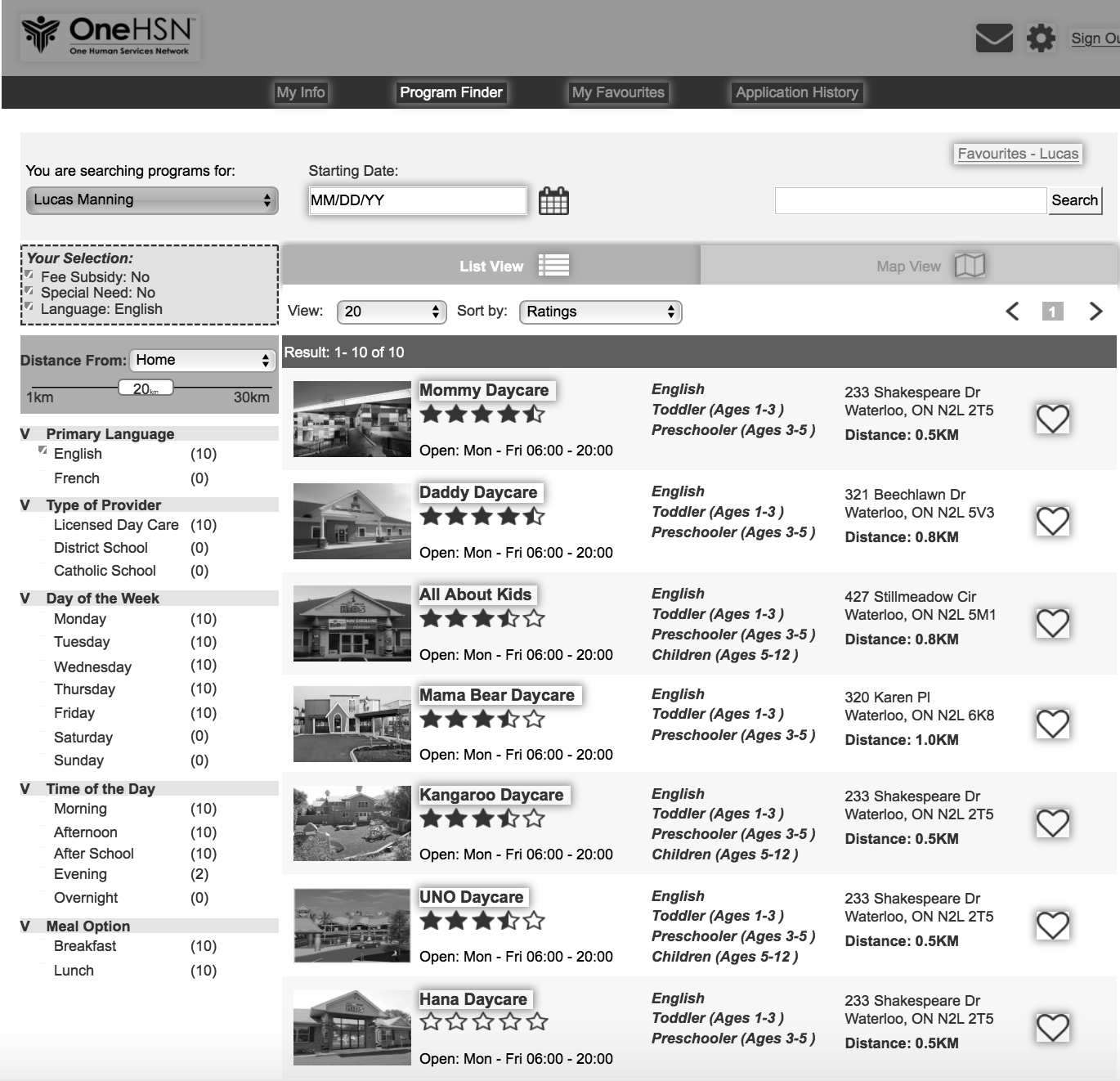
SEARCH
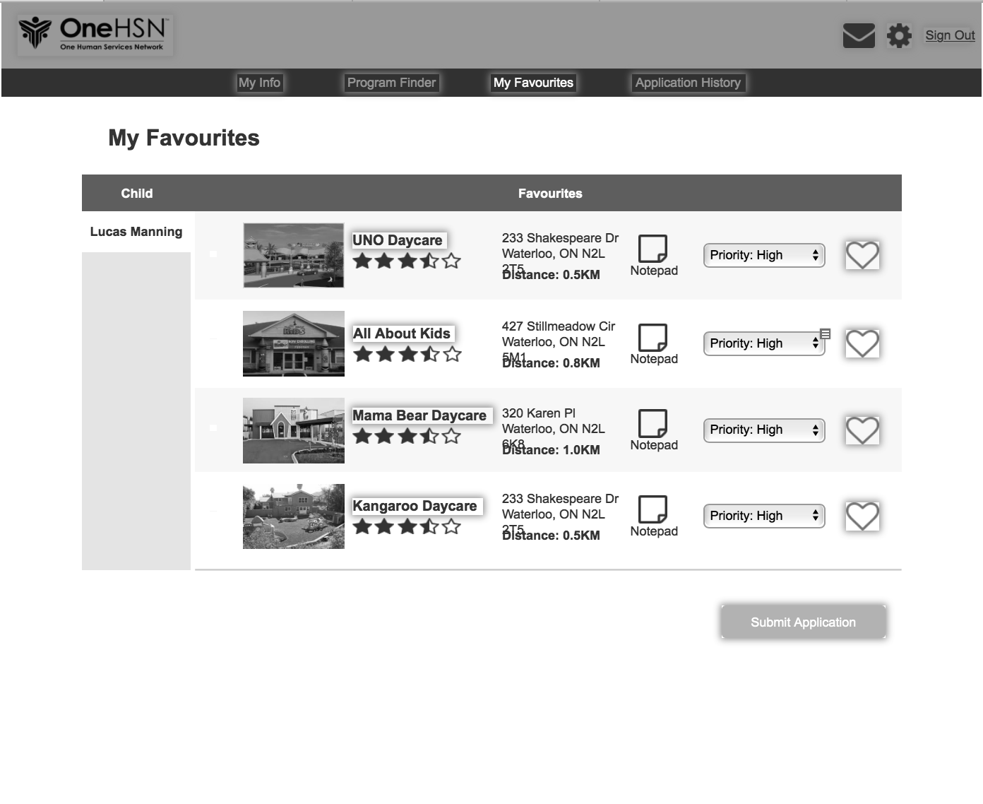
Users can easily modify their search and sort their favourites. Information hierarchy is linear yet comprehensive. The new design allows users to understand how their preference affects search results instantly and adjust it to get their preferred results.


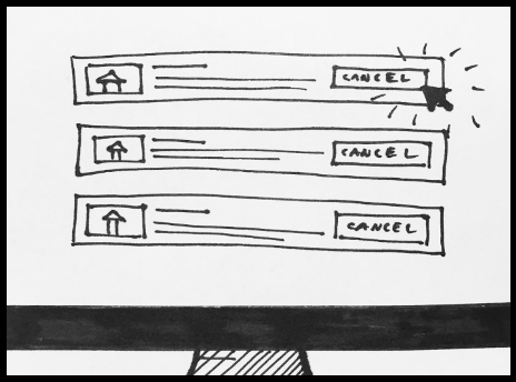
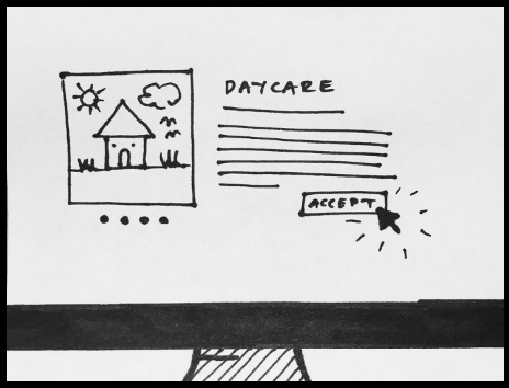
APPLY
Once users reselect their preferred daycares, they can easily edit, share, contact and make notes to each selection. We noticed many users rely on additional post-its and notepads to write down additional information. This was not only inconvenient but also made users unsure about their selection choices. This dashboard centralized dispersed information and allows users make better and more confident choices.


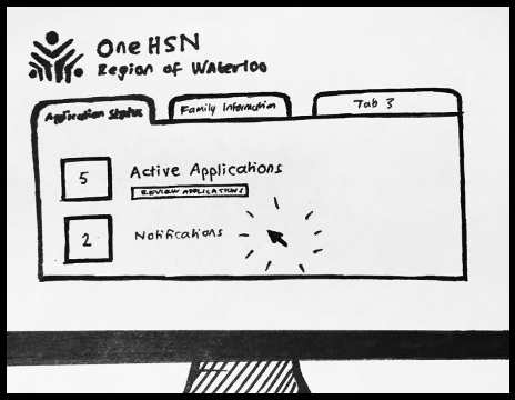
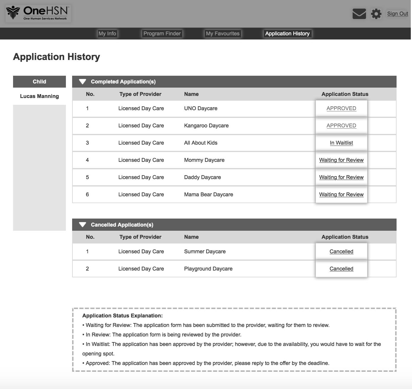
MANAGE
Once users make their submissions, they can now go to their application dashboard to check the status and manage. This takes away the “black boxed” experience about how their applications get processed, reviewed and edited. Here, users can monitor the progress of each application and contact the service providers or our help desk for further assistance.
